 2427 views
 Munim has been redesigned with a cleaner, more user-friendly interface to help you manage accounting effortlessly. The new Design 2.1 enhances usability, simplifies navigation, and presents key information more effectively. Check out what’s new!
Enhanced Dashboard Overview – Key Insights at a Glance
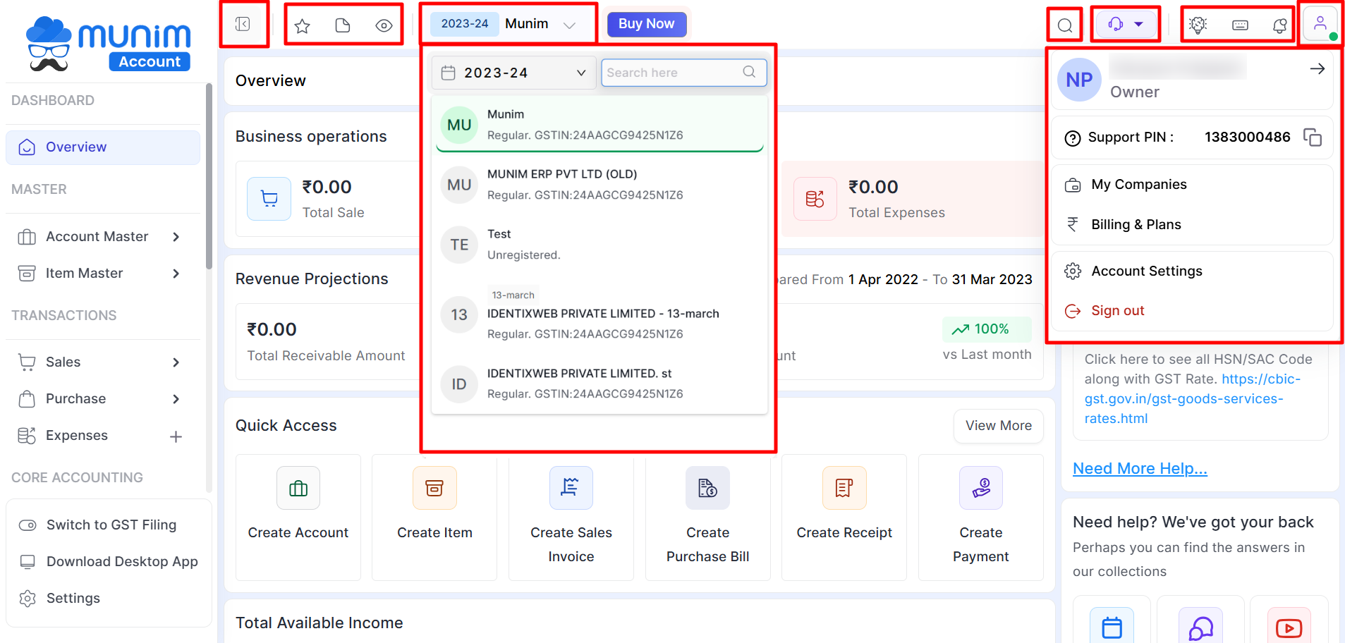
🔹 1. Header Section
We have added new refresh icon on dashboard in place of old icon, there is no change in action but only refresh look to make your daily activity more eye friendly
-
 Quick Links – Use this button to add your necessary module for easy access.
 -

-
 Show/Hide Amounts Option – Use this icon to show/hide your financial amounts on dashboard.
 - ✅ Company Selection & Financial Year Dropdown – Click this to change company & financial year.
-
 Quick Search – Use this icon for Quickly search software Modules and Reports.
 - Quick Support – Use this icon if you need our assistance with multiple support options.
- Missing Feature – User can submit a feature request, suggestion or bug.
- Keyboard Shortcuts – Use this icon to explore useful keyboard shortcuts for quick transaction entry.
- Notifications – Notifications are now easier to access.
- User profile – Access user related settings and modules quickly from the menu.
+−⟲
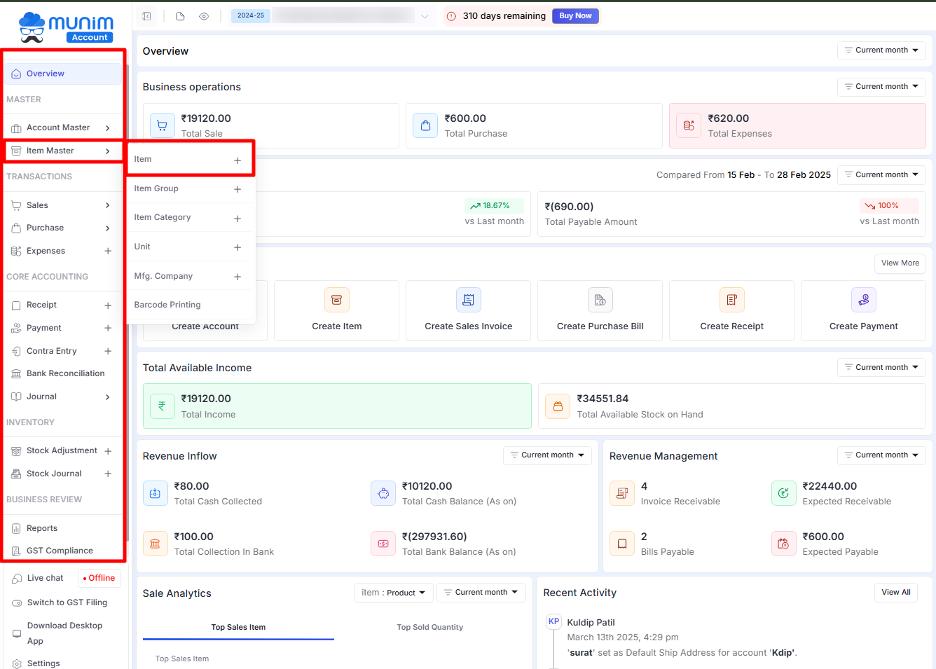
📌 2. Improved Side Menu
We have improved our side menu for your smoother activity, we have rearranged every module with sub module in group based on transaction co-relation to make your accounting activity quicker
- Main side menu grouping – We have improved our side manu for your smoother activity, we had rearranged every module with sub module in group based on transaction co-relation to make your accounting activity quicker. By Using this icon, you can Switch left main menu into Full menu or Icons only menu for a distraction-free experience.
- ✅ Better Contrast & Readability – Clearer text and spacing for easy identification of sections.
+−⟲
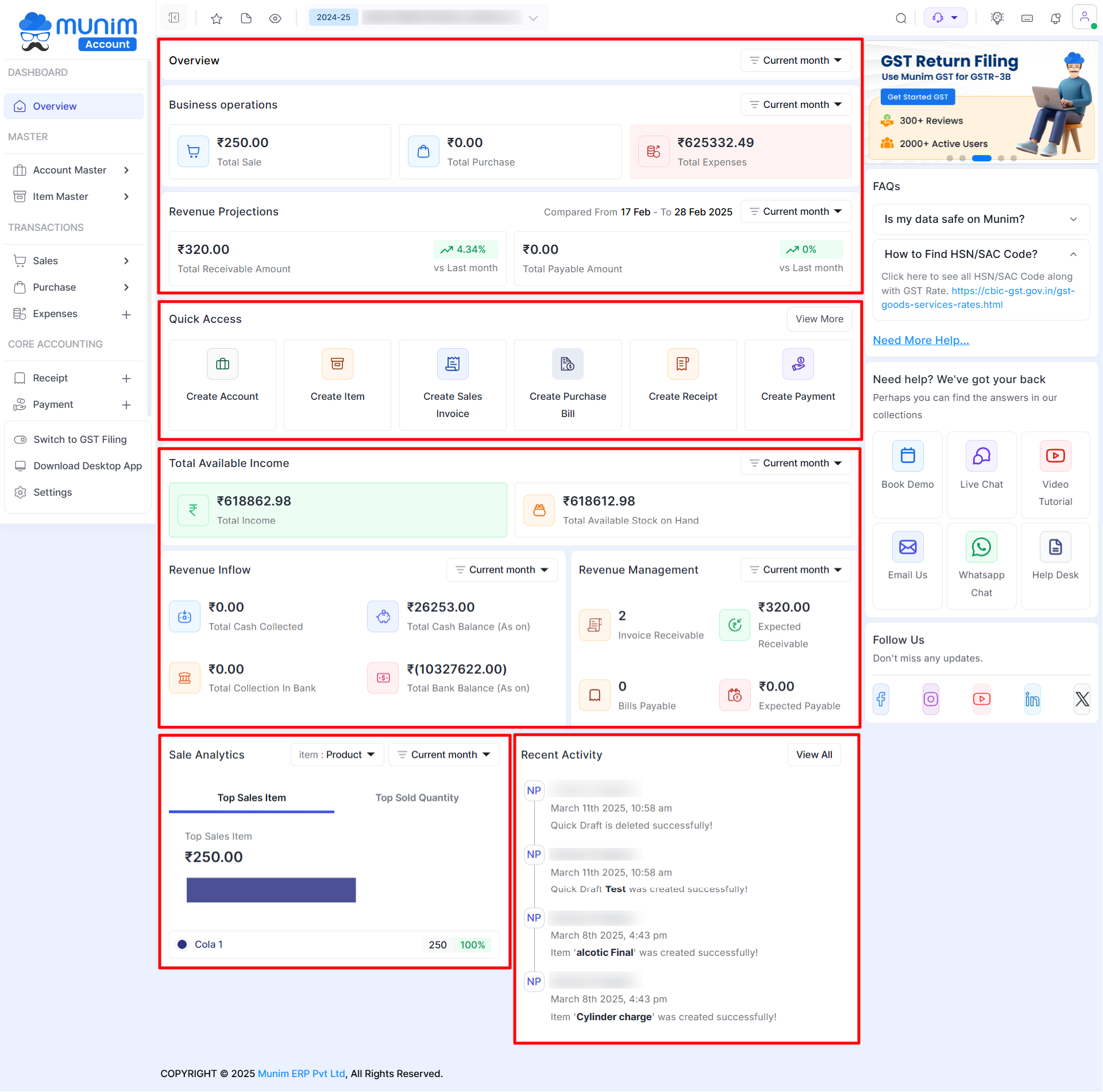
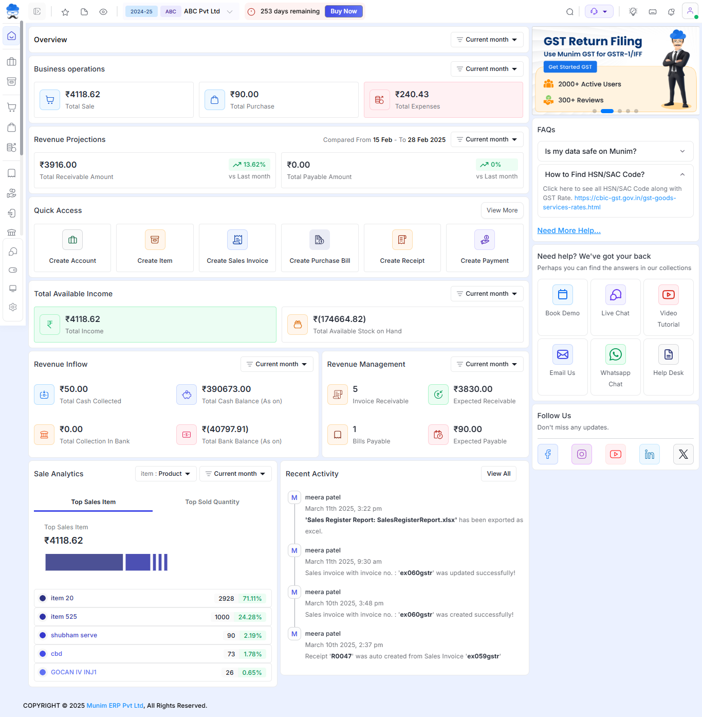
⚡ 3. Dashboard – Quick Analytical Overview
- ✅ Refined Financial Values – We have re-arrange position of ‘Total Sales, Total Purchase, Total Income, Total Expense and added stock available on hand to make your daily decision better and more clear and to track revenue, expenses, cash flow.
- ✅ Quick Access – We have placed all important module on dashboard for your easy and quickly access to it.
- ✅ Recent Activity – We have improved view of recent activity and add up detailed log to tracks who accessed or modified financial records.
+−⟲
🚀 4. Updated Buttons & Icons – Modern & Eye catching
- ✅ New Icon Set – More recognizable and visually appealing icons.
- ✅ Standardized Button Styles – Key Modules icons in Main Menu and inside module icons and buttons like Create, Edit, Print etc. are more distinct.
- ✅ Consistent UI Elements – Improved alignment and color scheme in entire software for better focus.
+−⟲
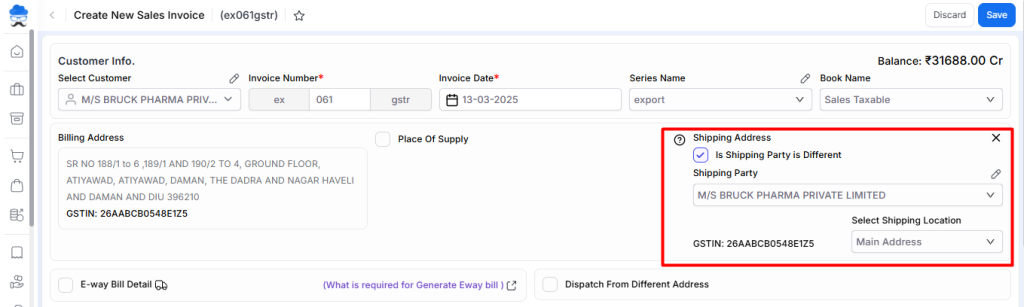
🚀 5. Reform sale invoice
We have rearranged activities in the Sales Invoice for a quicker workflow, here are some key improvements:
+−⟲
- ✅ Shipping address details-Now you can add/edit your shipping address details directly from sale invoice
+−⟲
- ✅ Additional details –Move “terms (days) “ “due date “ “ quotation no. in additional details section at footer side
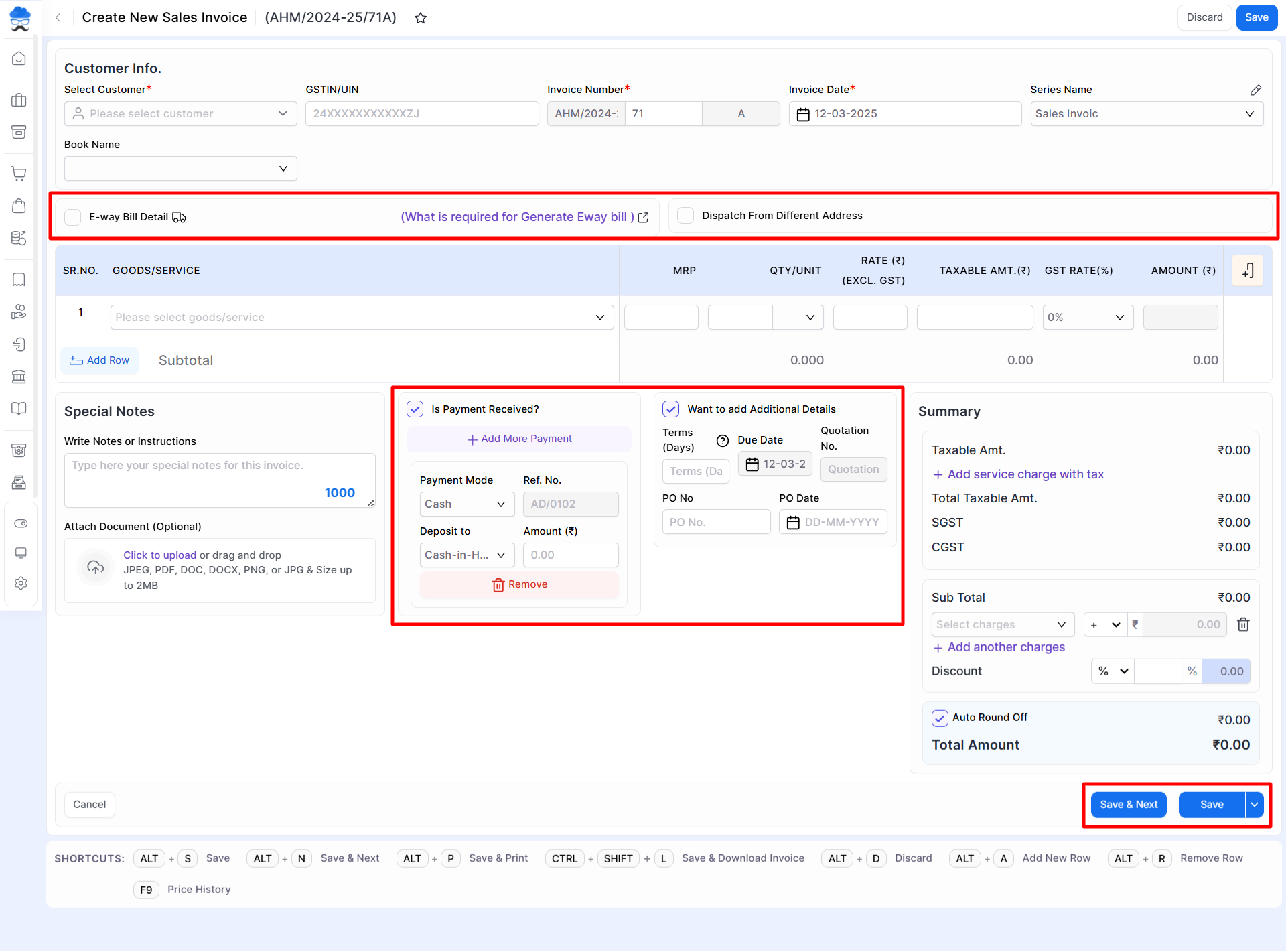
📊 5. Improved Forms & Input Fields – Faster & More Structured Data Entry
- ✅ Better Field Organization – All Forms are now more structured and visually clean.
- ✅ Optimized Spacing & Alignment – Makes inputting data easier and faster.
- ✅ Improved Drop-downs & Selection Options – Easier selection of accounts, items, and other fields.
- ✅ Organized Better – Made specific data fields like EwayBill easier and better manageable.
- ✅ Clutter free page – Organized additional fields like Due date, Po no., Quotation no. etc. in specific option and Payment Received data in specific section, Makes page look clean and easily manageable.
- ✅ Button and Attachment – Made Save button more useful by providing a Dropdown for specific user requirement while saving. Rearranged Attachment section for better page view.


